Ergodyne Brand Style Guide
THE ESSENTIAL
ERGODYNE

Logos
The spirit of the Ergodyne brand lives in the badge. Identified with an established date, bold color-scheme and the signature Ergoman. Tenacity defined.
Ergodyne Badge
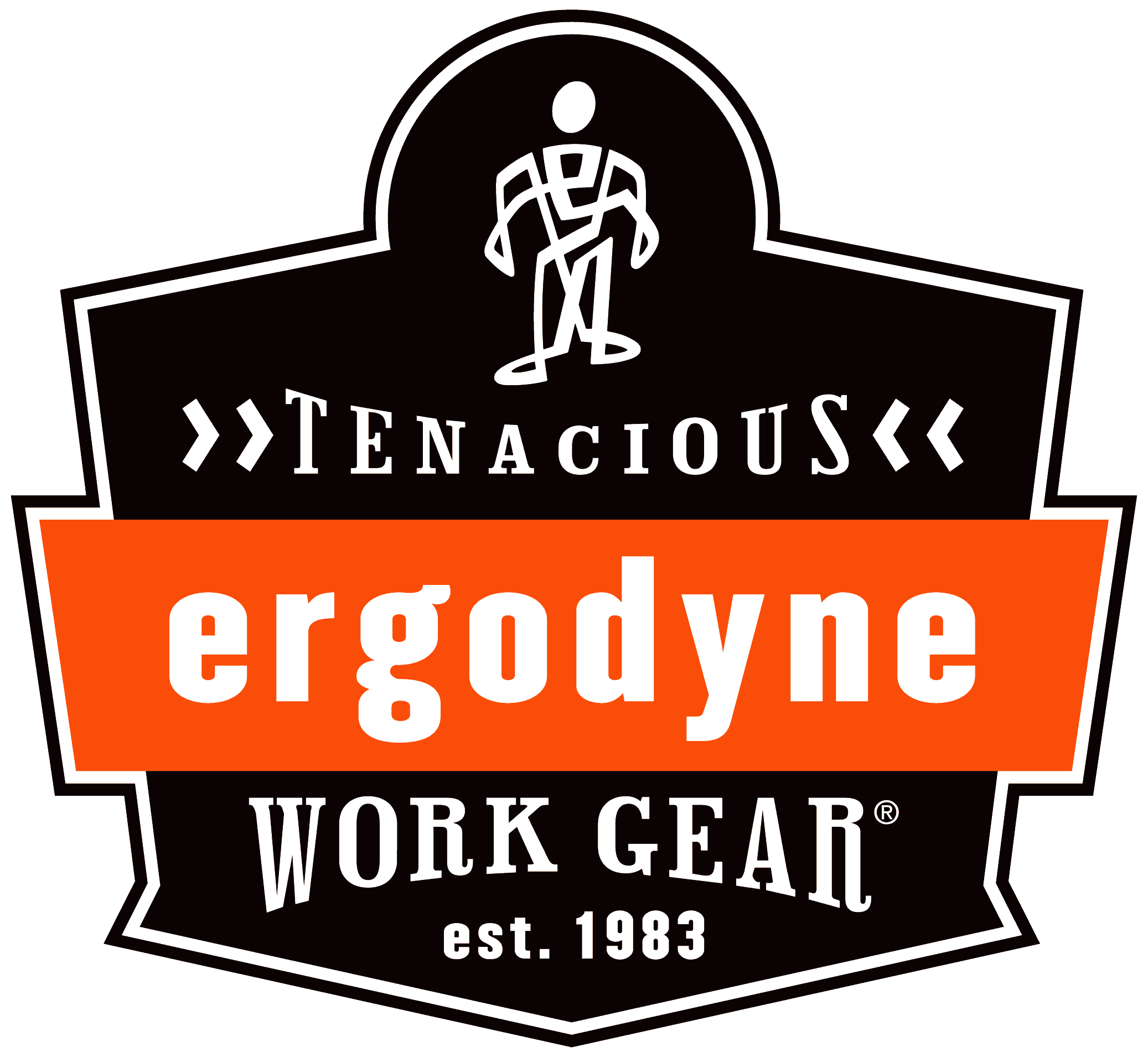
Rich Black + PMS1655
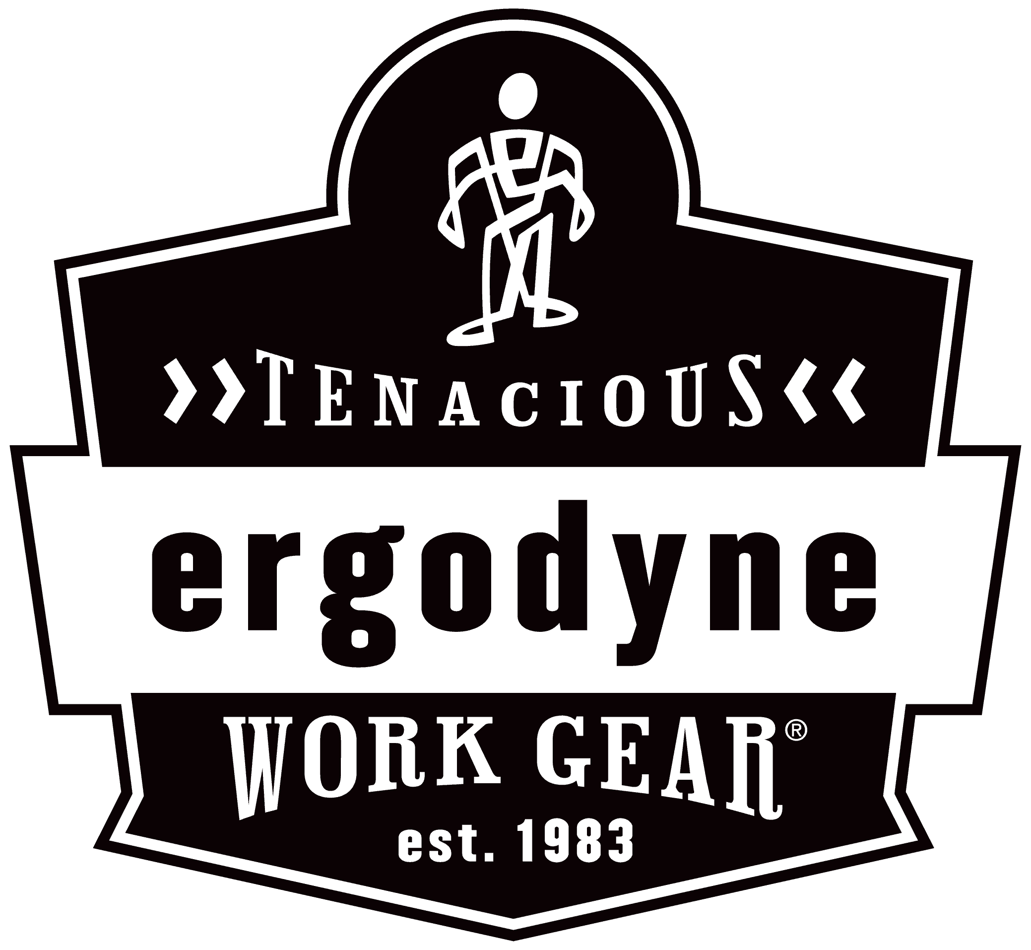
Use the outer white stroke which is visible on dark backgrounds.

Be sure to use the outer white stroke in all instances.
Correct Logo Usage
Just like your kids, some logo applications are better than others. To maintain legibility, it is recommended that the Ergodyne logo is used no smaller than 1" in its full Tenacious Work Gear® Badge Version. Our wordmark is approved to use in instances where the space requires smaller than 1".
Clear space
Nobody likes to be cramped. Give our badge a little shoulder room by ensuring at least an Ergoman's space around all sides.

Outlines
As illustrated here, the outer stroke is a critical element to the Ergodyne Badge. It adds contrast and separation regardless of background.
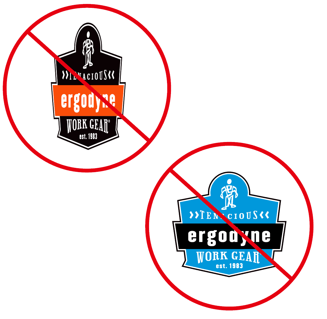
Incorrect usage
Please don't skew, squash, rotate or recolor the badge. Thank you!
Ergodyne Wordmark
Be Tenacious Wordmark
Colors
Ahh orange... The boldest of hues. Our color is our brand and we are proud of it. To maintain it, we ask that you use the specified colors and watch them with an unwavering eye. Use the correct formula for the type of project you're working on and mix in the appropriate amount of black, white and gray. Voila!
Color Palette
Pantone: 1655C
CMYK: C=0, M=84, Y=100, K=0
RGB: (255, 77, 0)
HEX: #FF4C00
Pantone: Black
CMYK: Rich Black C=30, M=30, Y=30, K=100
RGB: (10, 2, 3)
HEX: #0A0203
Pantone: Cool Gray 4C
CMYK: C=0, M=0, Y=0, K=30
RGB: (188, 190, 192)
HEX: #BCBEC0
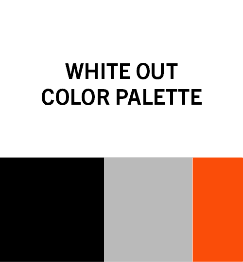
Color Story
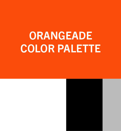
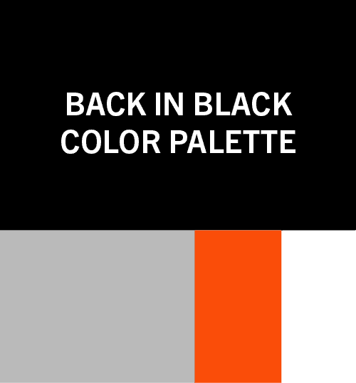
Our corporate color is bold, unique, and identifiable. But simply painting the world orange isn't enough. It needs a supporting cast. A Jon to the Ponch, cowbell to a thumping bass line, a C3PO to its R2D2. You get the idea. In these sample color palettes, you'll see a primary color and varying percentages of color to support and round out the overall Ergo-ness.
Typefaces
Ergodyne typefaces are lovingly hand selected to communicate our all-important mission clearly, legibly and with a sprinkle of panache. The following typefaces should be utilized for all Ergodyne marketing materials. For Web applications, Oswald is the preferred primary typeface.
Champion HTF Welterweight
The san serif of choice for headlines.

Hoboken
A funky lil' typeface alternative option for headlines.

Trade Gothic Next LT Pro
The hardest working san serif in the Ergodyne library used for product info in various weights.

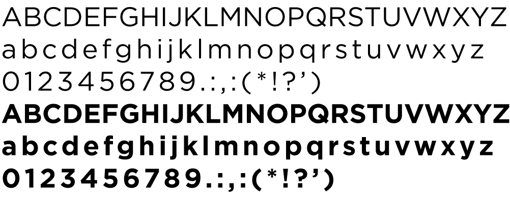
Gotham
A geometric sans-serif font with several weight options for headline to primary body copy usage.
Arial
Typically used in PowerPoint presentations and word documents, as well as being a common typeface that is generally installed on all computers

Oswald
Preferred typeface for web applications. Available on Google Fonts.

Photography
Big, bold and heroic scene setters. Informative and authentic application shots. Detailed and descriptive studio photography. Our image library is stocked with striking visuals to support every level of Ergodyne story telling. Email BrandPolice@ergodyne.com for access.

Have questions?
Shoot us a message at BrandPolice@ergodyne.com
